


1/11 Studio Bille
Blending the ideas of both luxury and European modernity formed our over-arching guiding concept for a website redesign for Studio Bille. We translated Maria’s effortless passion for minimalism into a full e-commerce digital suite, underpinned by fresh and considered campaign imagery. With a focus on the notion of simplicity, we played with functionality and produced a comprehensive digital space that accentuates Maria’s style and unique perspective. Much of our work with Studio Bille is rooted in our look book design, a digital and printed space reserved for applying the website structure to a more versatile environment. Each season we re-produce the brand’s look book, exploring brand evolution and creative adaption as Maria continues to design and produce conscious pieces of art. The look books honour Studio Bille’s growth as a brand, and is an opportunity to establish the moving eras of the brand.
Logo Configuration
Print Design (Care Notes, Business Cards, Flyers, Posters)
Digital Design (Look Books)
E-commerce Web Design and Development
Logo Configuration
Print Design (Care Notes, Business Cards, Flyers, Posters)
Digital Design (Look Books)
E-commerce Web Design and Development
2/11 EILAF
Our long-term partnership with EILAF has spanned many years, and our work has always been focused on versatility and flexibility, ensuring the brand identity is given the space to evolve and adapt through the seasons. The brand system plays on innovation, exploring traditional craftsmanship but through a modern lens. We established a rich palette of earthy colours alongside a hand-drawn custom logotype based on hand-painted way-finding found in Zanzibar. We developed a purposeful e-commerce platform for EILAF, to invite a heightened online experience for users, utilising ongoing storytelling that effortlessly highlights EILAF’s mission as a brand. Components of the site include videography by Nassor Othman, asymmetrical page layouts and simplistic product imagery.
These elements came together to produce an impactful and exclusive digital space that allows the brand to faithfully illustrate how they have managed to nurture and support their weavers. Our print and digital design work for EILAF includes Look books for potential wholesale partners. The spreads are designed to engage with the cohesivity of the brand and website, underscoring the brand ethos and further extending visual storytelling. These design pieces for EILAF are useful in contributing to their marketing and brand strategy as well as strengthening their industry connections.
E-commerce Web Design
End-to-End Identity Design
Print Design
Digital Design (Lookbooks, Press Kits, Socials)
View Project
Above, Videography by Nassor Othman
Filmed in Zanzibar, featuring the Dom Basket with gold engraved logotype by Somewhere Still.
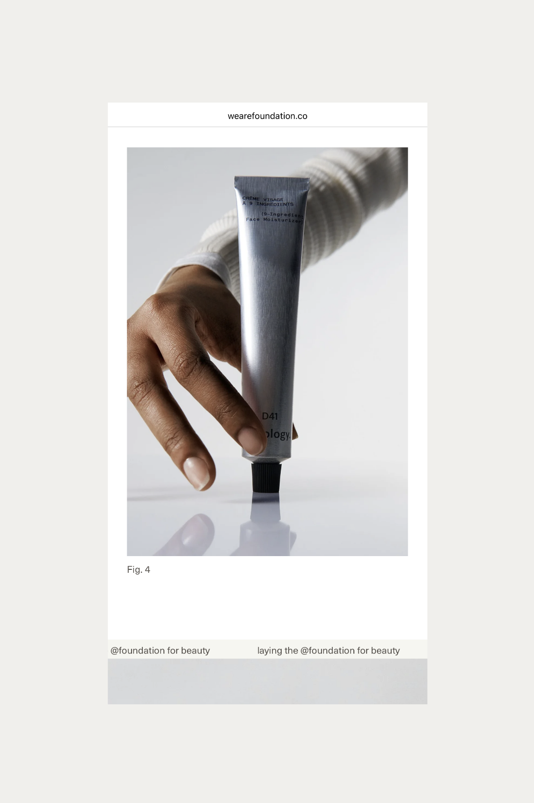

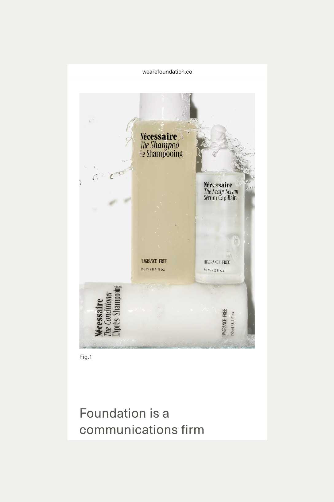
3/11 Foundation
Foundation co-founders, Jenny and Kelly, approached the Somewhere Still studio to discuss a comprehensive rebrand for their bi-coastal communications agency. We re-defined their leading logotype to produce a modern and unified typeface alongside a minimal and enclosed brand mark that anchored the brand ethos of intuitive and strategic thinking. The logotype favours precision, strength, and has a clean functional finish, enhanced by a mineral-inspired colour palette. The distinctive identity was applied to a new portfolio website, designed to re-centre the brand and showcase its services and array of impressive clients. The site is consistent in form, visually uniting the refreshed identity in a digital landscape of varying type sizes, grid structures, and subtle movement. A simple information system across the web pages distils their offerings into a layered but clear expression of their mission as a business.
Portfolio Web Design
End-to-End Identity Design
Portfolio Web Design
End-to-End Identity Design
4/11 Passé the Store

London-based vintage homeware brand, Passé the Store, approached us to develop a custom logotype and website that would reflect the eclectic charm and understated refinement behind their curation of vintage objects. Founder, Dani Hides, sought to not only showcase and sell pieces she sourced across Europe, but also to create a digital space where she could house her own designs of ceramic homeware. The site, as a result, functions as a simplistic gallery of furniture, lighting fixtures, art, and objects, inviting both direct consumers and B2B consumers to browse and explore Dani’s highly thoughtful curation. The visual identity emphasises a European influence, setting the tone for pieces found in hidden markets across the Mediterranean. Typography and layout throughout this project draw inspiration from contemporary influences, paired with ease and clarity to create a straightforward e-commerce experience.
Custom Logotype
E-commerce Web Design
View Project
Custom Logotype
E-commerce Web Design
View Project
Above, 18th-century bobbin-turned side table, 62cm high x 67cm wide x 50cm deep.

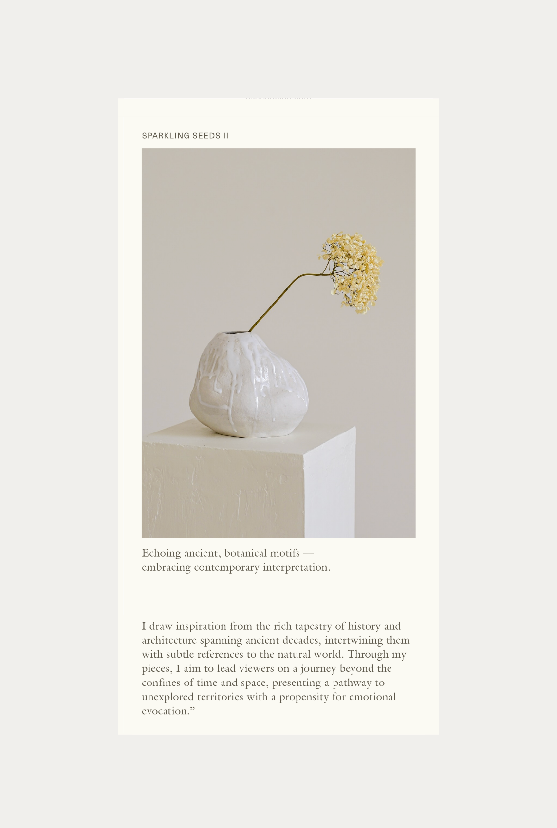
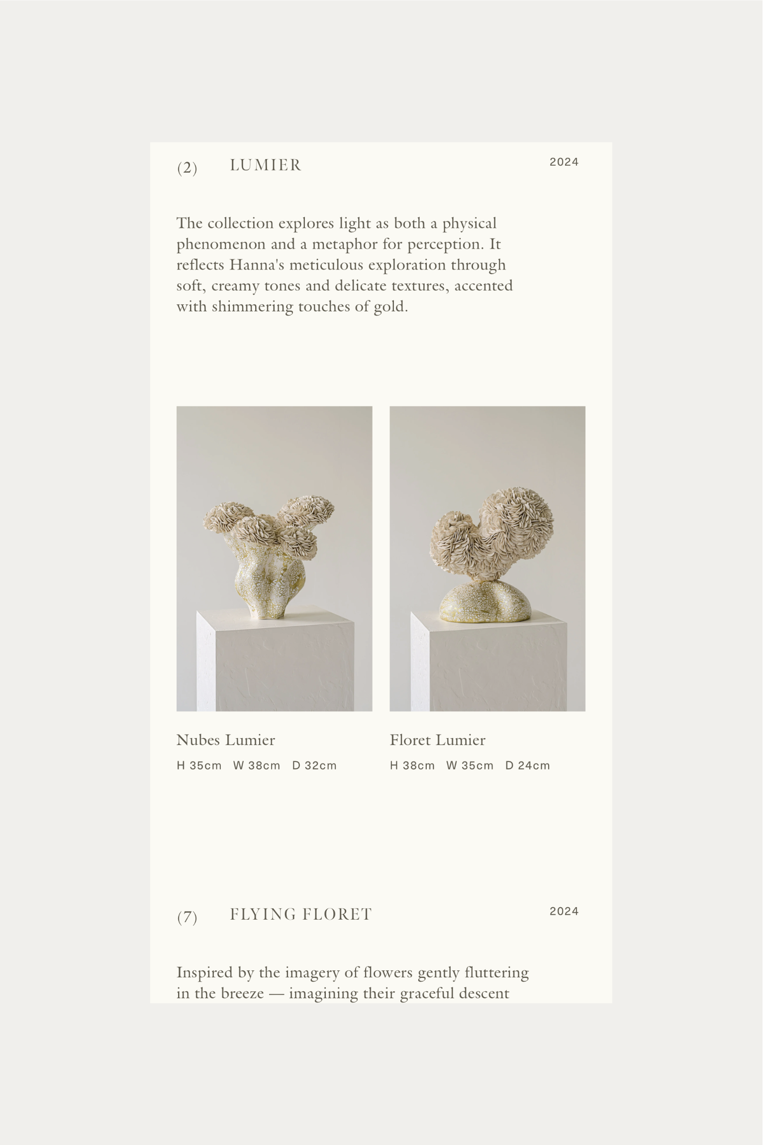
5/11 Hanna Heino
Ceramicist and artist Hanna Heino approached us to redesign her portfolio website, which is home to her grand collection of sculptures. Bridging time-honoured traditional craftsmanship practices with her contemporary design perspective aspires to open up the sculptural space with organic and natural forms. We reflect Hanna’s values through a clean and minimal website, which magnifies the time and work that Hanna assigns to each of her pieces. We create structure through her catalogue and soften the site with custom-drawn brand marks. Our system of Roman numerals instils heritage and tradition throughout the site. Our work with Hanna extended to brand identity, and we developed a visual concept that reflects Hanna’s overarching purpose as a ceramicist: to combine traditional craftsmanship with contemporary aesthetics. The identity encompasses an elegant custom logotype alongside a hand-drawn baroque swirl that captures Hanna’s balance and integrity as an artist. Using baroque references and an organic palette, we aimed to magnify the world that Hanna is so intuitively creating.
Portfolio Web Design
End-to-End Identity Design
Portfolio Web Design
End-to-End Identity Design
6/11 i seira

Using a variety of design and developmental systems, we produced for i seira an organised and minimal website that is enhanced with wish list functionality and strong brand visuals. Clean product photography reinforces the simplicity of the digital space, allowing for a calm and pleasant browsing experience. Architecture and sculpture have been a consistent throughline for the i seira brand, existing as references throughout Alexa’s designing process.
The redesigned site is now a tool for Alexa to not only showcase her pieces but also as a vehicle for building connections with jewelry lovers and industry peers. A full rebrand for i seira allowed for a complete re-understanding of Alexa’s vision when it comes to producing her work through considered and thoughtful series. We used distinguishing numbering systems to formulate a visual identity that pays homage to Alexa’s Greek heritage. The updated identity reflects Alexa’s love for minimal design shapes and codes, and focuses on a stone-centric colour palette that underpins the sculptural inspirations.
E-commerce Web Design and Development
End-to-End Identity Design
Print Design
Digital Design (Socials, Emails)
View Project
Above, Custom Logotype for i seira by Somewhere Still. Photography by Taylor Tupy.


7/11 MACADAM
NYC-inspired brand MACADAM invited us to develop a new e-commerce site to house their incredible geometric and abstract collection of jewelry. The new website includes pieces presented minimally, but effectively in a clean gallery-inspired space, paired with art-deco image frames that welcome users into the site, establishing an immersive digital portal, deepened by the inclusion of ‘My MACADAM’; a world for members to purchase, explore, and delve into the details of MACADAM. The connection between Manhattan and jewelry design sparks the project’s central insight: to create a sleek, editorial, elegant space for browsing, shopping, and exploring all things MACADAM.
E-commerce Web Design and Development
Digital Design (Socials, Emails)
E-commerce Web Design and Development
Digital Design (Socials, Emails)
8/11 One West Studio

Interior Design Practice, One West Studio, invited us to develop a new brand language and accompanying portfolio site to present their ever-evolving work. A new immersive portal for One West Studio was established, complete with a fully built-out portfolio and journal space, reflecting and translating Founder Haley’s SoCal style with her transparent approach to interior design. A grid structure was implemented across the digital space, aligning subtly with the identity, designed to separate out information in a clear and architectural sense. The project brief demanded both a strategic repositioning of the brand and a complete visual departure from generic interior branding. The new colour palette sits in soft neutral tones, and the paired typographic system has been developed to communicate clarity balanced with expertise.
End-to-End Brand Identity
Portfolio Web Design and Development
Print Design
Digital Design (Socials)
View Project
End-to-End Brand Identity
Portfolio Web Design and Development
Print Design
Digital Design (Socials)
View Project
Above, Custom Logotype for One West Studio by Somewhere Still. Photography by Amy Bartlam.

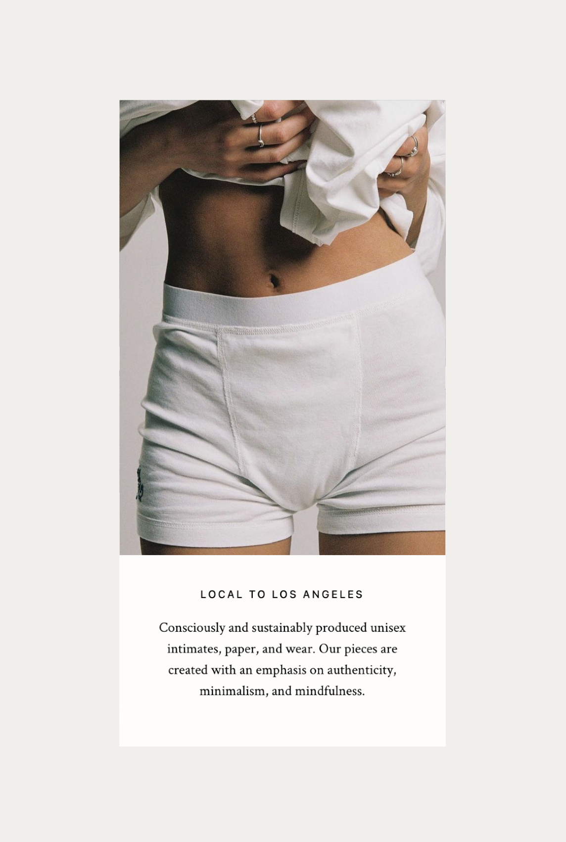

9/11 Poppy Undies
Focusing on a combination of both e-commerce and creative portfolio functions, the Poppy Undies site was designed and developed to serve as an editorial and clean online space. High functionality and a generous use of white and negative space produces a contemporary perspective which is layered with 90s-minimalism in both web elements and brand imagery. We created a custom page to house those wearing their Poppy Undies in an image library utilising hover functions, creating an interactive and intuitive site, reflecting and illuminating Emily’s playful and ever-so-cool nature.
E-commerce Web Design and Development
E-commerce Web Design and Development
10/11 Anna May Henry Florals
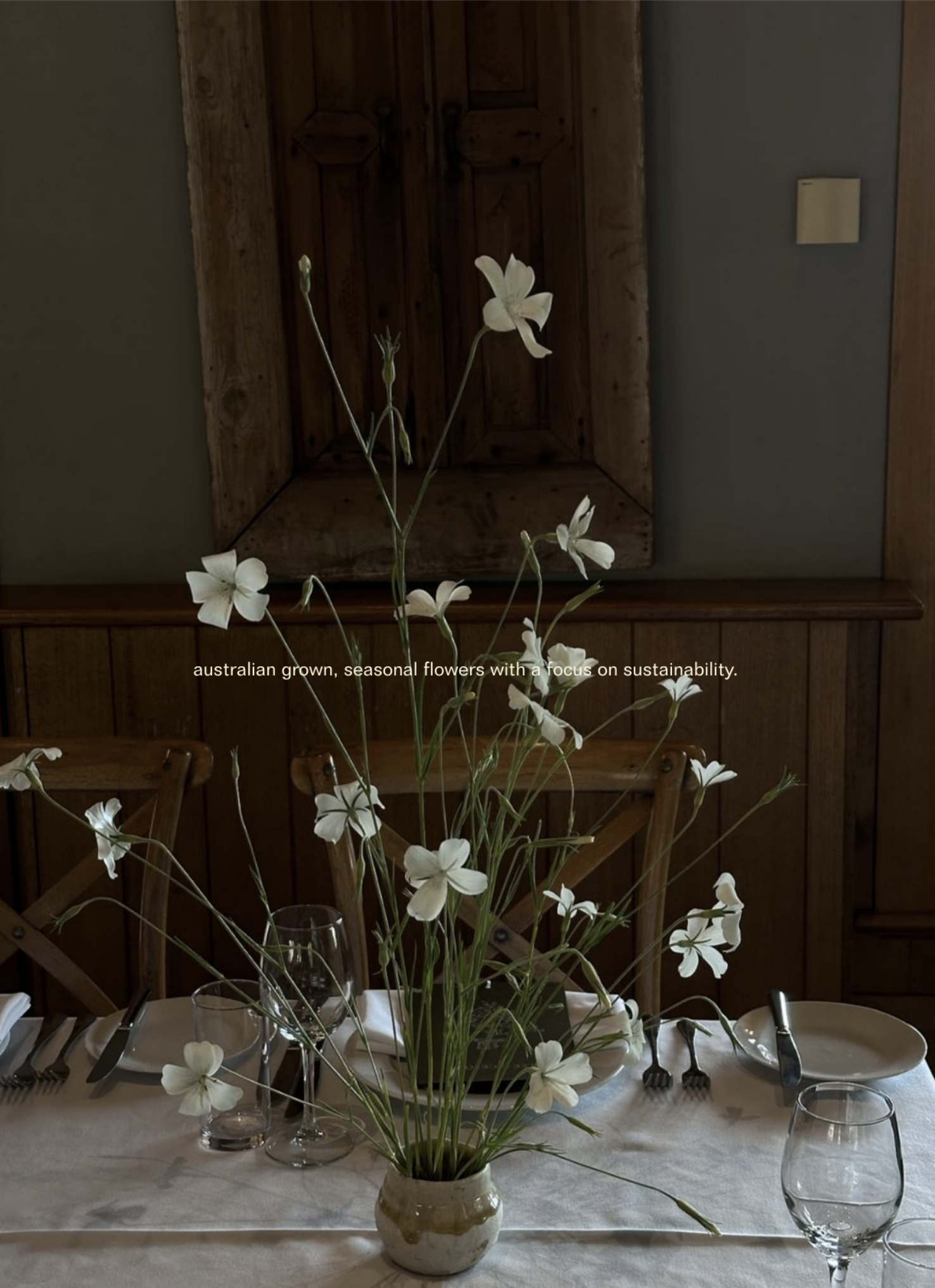
Partnering with Florist Anna May Henry on a comprehensive rebrand was a pleasure; we focused on a subtle refinement of across-the-board typography alongside a contemporary logotype that playfully draws its form from nature. Our strategic process was driven by an inherent curiosity for Anna’s incredible intuition as a florist. Small, considered type treatments form the guiding concept of the visual language, designed to feel soft and, on occasion, spontaneous. Our long-term partnership has, over time, developed and evolved as Anna’s brand has done, and we’ve continued to support Anna and her values through considered design practices. We’ve translated Anna’s clear and sustainable ethos into a simple and versatile ecosystem of type, soft colour, and elegant layout treatments.
E-commerce Web Design
Print Design
Apparel Design
Digital Design
View Project
E-commerce Web Design
Print Design
Apparel Design
Digital Design
View Project
Above, Typography
for Anna May Henry Florals by Somewhere Still.
11/11 Linda Hoj
The strategy behind the identity design for Linda Hoj was rooted in a desire to render the brand’s unique style and aesthetic in an ornate and decadent manner. The visual language is led by a crest-inspired illustrative brand mark, designed to calibrate the codes of history and luxury storytelling through detail-oriented design practices. The distinctive design system has been applied to a new e-commerce website, designed to re-centre the brand and showcase Linda’s collections of beautifully designed, handcrafted, one-of-a-kind jewelry. Quiet luxury informs the design of prices appearing only on hover, allowing a cleaner user experience throughout. The e-commerce functionality is streamlined and effortless, rows and layers of stunning jewelry are rendered naturally across the pages, and can be viewed at a variety of sizing to suit each user.
The icon follows and guides the user around the site, adding whimsy and detail, enhancing the space with Linda’s specific and artistic perspective.
The icon follows and guides the user around the site, adding whimsy and detail, enhancing the space with Linda’s specific and artistic perspective.
E-commerce Web Design and Development
End-to-End Identity Design
Print Design (Business Cards)
Digital Design (Emails)
End-to-End Identity Design
Print Design (Business Cards)
Digital Design (Emails)